 Skip to content
It’s March 2026, and a CFO has exactly 90 seconds between meetings to skim a Q1 performance deck. She doesn’t read it—she scans. Her eyes land on a red bar extending past expected bounds, a bold number in the corner, and a trend line dipping sharply in February. Within those 90 seconds, she’s already formed a mental model of what happened and what questions to ask.
The idea of presenting information visually is ancient—maps have been drawn for thousands of years to communicate complex information. The data visualization field began to evolve significantly in the late 18th and early 19th centuries as countries started collecting and publishing data. William Playfair, often regarded as the father of data visualization, invented area charts, line graphs, and bar charts. In 1786, he published The Commercial and Political Atlas, the first known work with statistical infographics. Today, understanding the evolution of data visualization also benefits from a computer science perspective, as highlighted by experts like Jeff Heer, who interpret and extend the field’s history through the lens of computational advances and scientific rigor.
This scenario plays out thousands of times daily in boardrooms, investor calls, and strategy sessions. The psychology of data presentation determines what gets noticed, what gets ignored, and ultimately, what drives decisions. By understanding the psychology of data visualization—how human perception and cognitive biases influence interpretation—presenters can make visual data communication more effective and impactful.
Why the Psychology of Data Visualization Matters in 2026
Data presentation isn’t just about accuracy. The human brain processes visual information through specific cognitive pathways, and understanding these pathways determines whether your carefully prepared numbers actually land with your audience. Many issues in information visualization are analyzed from a largely psychological perspective, focusing on how perception and cognition influence the effectiveness of visual data representations.
Here’s a critical distinction: data visualization refers to a single chart or graph, while data presentation encompasses the entire story across slides, dashboards, and exports. A well-designed bar chart means nothing if it’s buried in a cluttered slide where the viewer’s visual processing system can’t quickly extract the key insights.
Most recurring reports—monthly financials, portfolio reviews, weekly marketing performance—still rely on manual PowerPoint work. Teams copy-paste from Excel, adjust formatting, and hope everything aligns, even though financial reporting automation can radically reduce this manual burden. This process often clashes directly with how people actually process visual stimuli, creating cognitive load that obscures rather than reveals meaningful insights. Visualization methods and description information visualization—pictorial representations of data—are key approaches to presenting information in ways that enhance understanding and support effective communication.
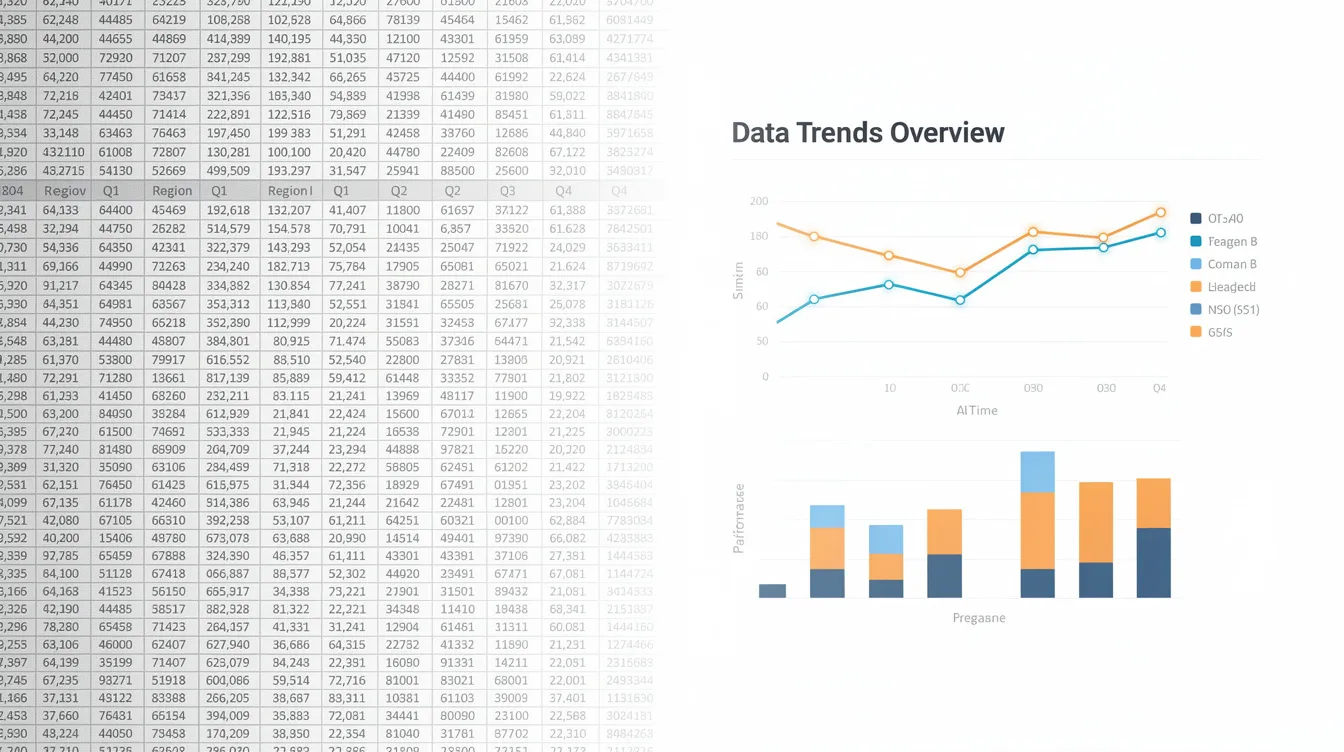
INSYNCR is a PowerPoint automation plugin that helps teams systematically apply psychological best practices to every recurring presentation at scale. Readers who want to understand how Automator and Viewer roles, data connections, and licensing work in detail can explore the INSYNCR FAQ on the plugin’s capabilities. By connecting slides to live data sources, teams can lock in designs optimized for human brain processes and reuse them indefinitely.
The Visual Brain: How Humans Really Read Slides
How Executives Scan Slides
Research from cognitive science reveals that approximately 50% of our cerebral cortex is dedicated to visual processing. People can identify simple visual patterns in under 200 milliseconds—faster than conscious thought kicks in.
Executives don’t read slides linearly. They scan for:
-
Outliers that break expected patterns
-
Color cues signaling exceptions or emphasis
-
Size variations indicating importance
-
Position along scales for quick magnitude judgments
Reducing Cognitive Load with Visuals
When presented with dense tables or bullet lists, the brain must process information sequentially, spiking cognitive load by 30-50%. Well-structured visuals and consistent layouts reduce this load, enabling comprehension speeds 40-60% faster than text-heavy alternatives.
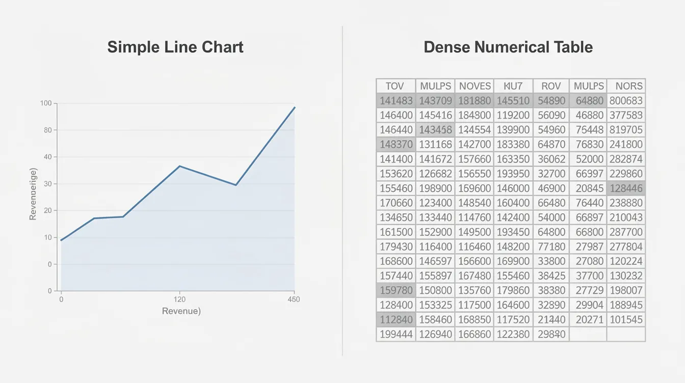
Consider quarterly revenue trends from 2018-2025:
-
A table with 28 numbers requires row-by-row scanning, and viewers often miss the 2022 dip entirely amid the numerical noise.
-
A line chart displays the same data but allows instant outlier detection—the dip pops immediately through pre-attentive processing.
Pre-attentive Processing: The Fast Lane of Visual Perception
What is Pre-attentive Processing?
Pre-attentive processing is the brain’s built-in shortcut for making sense of visual information at lightning speed. Before you’re even aware of it, your visual system scans a scene and instantly picks out the most critical data points—often in less than 250 milliseconds. This rapid, automatic filtering is what allows effective data visualization to cut through the noise of complex data and direct attention exactly where it’s needed.
Leveraging Pre-attentive Processing in Data Visualization
When you present data, especially in high-stakes business environments, you can’t rely on your audience to read every number or analyze every chart. Instead, you need to design visualizations that align with how the human brain naturally processes visual information. By leveraging pre-attentive processing, you ensure that key performance indicators and important trends stand out immediately, even in a sea of complex datasets.
Visual elements such as color, size, and shape are powerful tools for guiding visual perception:
-
A bar chart with one bar in a bold color instantly draws the eye to the most critical data point.
-
A line chart can highlight patterns and shifts in performance over time.
These visual cues allow viewers to process visual information and extract key insights without conscious effort, reducing cognitive load and making even the most complex data accessible.
This principle is especially valuable in data journalism and business reporting, where the goal is to tell a compelling data story. By using pre-attentive features—like highlighting outliers, emphasizing trends, or using contrasting colors for exceptions—you help your audience grasp the narrative behind the numbers in seconds. This approach not only makes your data visualizations more effective but also ensures that your most important messages aren’t lost in the details.
Interactive graphics take this a step further, allowing users to explore complex datasets and uncover patterns on their own. By enabling viewers to filter, zoom, or highlight different aspects of the data, you empower them to engage with the information and discover key insights that might otherwise remain hidden.
Ultimately, understanding and applying pre-attentive processing is essential for anyone who needs to present data—whether you’re a data scientist, a business analyst, or a data journalist. By designing visualizations that align with the way the human brain processes visual information, you transform complex data into clear, actionable insights that drive better decisions.
Core Psychological Principles Behind Effective Data Visualization
Three psychological concepts form the foundation of effective data visualization: pre-attentive processing, visual variables, and gestalt principles. Understanding these transforms how you present data.
Pre-attentive Processing
Pre-attentive processing occurs when the brain detects visual features within 100-250 milliseconds, before conscious attention engages. Your audience spots differences in color, position, and size automatically. This is why highlighting key insights with color works—the brain can’t help but notice.
Visual Variables
Visual variables are the building blocks of graphical methods. Jacques Bertin introduced the concept of visual variables in 1967, and his book The Semiology of Graphics significantly advanced the methodology and effectiveness of quantitative graphs. The following visual features are especially important, listed in order of accuracy for cognitive tasks:
-
Position along a common scale: most accurate for quantitative comparisons (< 5% judgment error) and the easiest for the human brain to recognize and evaluate
-
Size: larger elements naturally attract more attention and are effective for highlighting key insights; using size strategically helps viewers quickly identify the most critical data points
-
Shape: best for categorical distinctions; using shape strategically can help viewers identify important data
-
Color hue: useful for categories but least accurate for magnitude; understanding how color works and its impact on perception is essential for effective data visualization design
Other variables include:
-
Length: highly effective for bar chart comparisons
-
Area: prone to 20-30% perception distortions
-
Orientation: best for categorical distinctions
Using a limited color palette can enhance comprehension and reduce cognitive load. Color should be used strategically to convey meaning and reduce cognitive load in data visualizations. Using a high-contrast, color-blind friendly palette ensures accessibility for all viewers. Whitespace in visualizations helps reduce cognitive load by allowing viewers to focus on the data without distraction. Direct labeling reduces eye movement and simplifies data interpretation. Working memory is limited, so cognitive overload can occur when data complexity is high. Using visual variables effectively can enhance the clarity of data visualizations.
Key Gestalt Principles
Gestalt principles describe how the brain groups visual elements:
-
Proximity: elements close together appear related
-
Similarity: same colors or shapes suggest connection
-
Enclosure: boxed content forms a cognitive unit
-
Continuity: smooth lines guide the eye naturally
-
Figure-ground: the Law of Figure-Ground states that the brain separates objects into foreground and background, which is crucial for effective data visualization
-
Closure: the Law of Closure indicates that the human brain organizes complex visual elements into recognizable patterns, filling in gaps to create a complete image; the brain fills in gaps to perceive incomplete shapes, aiding in clearer data representation
-
Symmetry: the Law of Symmetry indicates that symmetrical visual elements are perceived as a unified group, while asymmetrical arrangements draw attention to disbalance
-
Focal point: the Law of Focal Point states that distinctive visual elements capture and hold a viewer’s attention, creating a focal point in the presentation
Visual cues such as color or shape help audiences recognize which displayed data belong together. Single high-contrast colors can be used as focal points to draw attention to specific data trends. Warm colors signal urgency, while cool colors evoke calmness and trust.
Consider a KPI dashboard showing regional performance. By reordering metrics using proximity (placing revenue near growth rate), applying similarity through consistent blue tones for positive indicators and red for negatives, and using subtle enclosure panels for regions like North America versus EMEA, viewers shift from parsing scattered data to instantly grasping “growth is slowing in EMEA”—all within 200 milliseconds.
Visual Variables: The Building Blocks of Data Encoding
Visual variables are the essential tools that transform raw numbers into meaningful, actionable visuals. In the world of data visualization, these variables—such as position, size, shape, color, and orientation—are the building blocks that allow us to encode complex data in a way the human brain can quickly interpret. By leveraging visual variables, presenters can reduce cognitive load and ensure that critical data points stand out, making even the most complex datasets accessible and actionable.
The power of visual variables lies in their ability to tap into the brain’s natural strengths. Our brains are wired to process visual information far more efficiently than text, which is why effective data visualization relies on these variables to highlight key insights and patterns. For example, a bar chart uses position and size to make key performance indicators instantly recognizable, while a line chart might use color and orientation to reveal trends or correlations that would be buried in a spreadsheet.
In practice, visual variables are what enable data scientists, analysts, and data journalists to present data in a way that tells a compelling narrative. By carefully choosing which variables to use—such as using a bold color to create a focal point on the most critical data point, or varying shape to distinguish between categories—designers can guide the viewer’s attention and make the data story clear at a glance. This is especially important in data journalism, where the goal is not just to display data, but to engage audiences and make complex information relatable.
The psychology of data visualization underscores the importance of visual variables in pre-attentive processing. Before we consciously focus on a chart, our brains are already scanning for differences in color, size, and position—allowing us to spot outliers or trends in milliseconds. By aligning visual variables with these pre-attentive cues, designers can ensure that viewers grasp the most important information without effort, reducing cognitive load and supporting faster, more confident decision-making.
Visual variables also play a crucial role in creating interactive graphics and dynamic dashboards. By enabling users to filter, zoom, or highlight different aspects of the data, these variables help uncover hidden patterns and make the exploration of complex data both intuitive and engaging. Whether you’re building a KPI dashboard for a board meeting or crafting a data-driven story for a wider audience, mastering visual variables is key to creating visualizations that are both informative and memorable.
In summary, visual variables are the foundation of effective data visualization. They empower presenters to turn complex data into clear, actionable insights, highlight the most critical data points, and craft compelling narratives that drive decisions. By understanding how the human brain processes visual information and applying visual variables strategically, anyone can create visualizations that not only inform, but inspire action.
From Psychology to Practice: Designing Data Presentations People Can Use
Building recurring decks—monthly board packs, investor updates, weekly performance reviews—requires translating psychological principles into practical design choices, and many teams benefit from step-by-step software guides for data-driven PowerPoint automation to operationalize those choices. The evolution of the statistical graph has played a foundational role in data analysis and interpretation, from early geographical maps to modern scatterplots and flow maps. The earliest known example of data visualization is likely a map from around 27,000 years ago, used primarily for representing geographical information. The use of statistics and infographics flourished in the 19th century, especially in fields like epidemiology and moral statistics; Florence Nightingale’s rose diagram is a key example, effectively communicating the impact of hygiene on reducing soldier death rates.
Chart Selection Based on Visual Perception
-
Use position and length first for critical data points: line and bar charts leverage the brain’s most accurate judgment mechanisms
-
Reserve area charts, pie charts, or complex visualizations only when categorical relationships matter more than precise magnitude
-
Later the pie chart should come in presentation order—never lead with area-based visuals for key performance indicators
Strategic Color Application
-
Establish a restrained palette: greys for contextual data, brand color for focal metrics
-
Use red and green for exceptions where culturally appropriate (noting these conventions reverse in some Asian contexts)
-
Limit accent colors to 3-4 maximum—more than 7 hues triggers pre-attentive overload
Applying Gestalt Principles Slide by Slide
-
Proximity: Place related numbers and charts close together; separate distinct topics with whitespace
-
Similarity: Use consistent shapes and colors for the same KPI across months
-
Enclosure: Apply light boxes or panels for regional groupings
-
Focal point: Highlight the most critical data points in brand color or bold sizing
Practical Layout Patterns
| Pattern Type | Structure | Best Use Case |
|---|---|---|
| Executive Summary | One headline + key metric + supporting chart | Board opening slides |
| Before/After | Side-by-side bars or line segments | Campaign results (2024 vs 2025 CPA) |
| Drill-Down | Primary story prominent, details subordinated | Detailed performance reviews |
These patterns ensure both the viewer and presenter can extract the data story within 30-60 seconds per slide.
The Hidden Cost of Manual Data Presentation Work
Finance and PE teams typically spend 8-20 hours monthly copying data into slides for recurring packs. This represents a massive hidden cost that compounds with every reporting cycle, a pattern echoed across industries in INSYNCR’s reporting automation resources and case updates.
Concrete scenarios:
-
A private equity team preparing 40 portfolio company reports every quarter, each with approximately 25 slides, totals 200-500 hours of manual work
-
A marketing team updating weekly performance decks from Google Sheets, Excel, and Meta Ads data spends 15-25 hours weekly on data manipulation and formatting
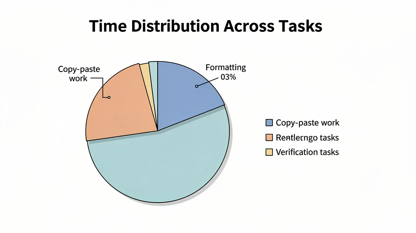
Where the time goes:
-
40-60% copying and pasting from Excel or BI tools into PowerPoint
-
20-30% aligning charts, colors, fonts, and layout to brand guidelines
-
10-20% checking and rechecking displayed data against source files
Efficiently manipulating data frames using statistical software such as R packages (tidyr, dplyr) can significantly streamline data preparation and reduce manual effort. For teams looking to upskill, there is a very nice interactive tutorial available that teaches data manipulation with tools like dplyr, featuring challenge questions and helpful diagrams to make the learning process engaging and practical, and complementary automation-focused reporting resources can help connect that data work to faster, more accurate presentations.
Psychology-linked disadvantages of manual work:
-
Error risk: Pasting wrong ranges or using outdated snapshots undermines audience trust. Even a 5-15% inaccuracy rate erodes credibility.
-
Inconsistent design: Varying colors, labels, and layouts force viewers to re-learn visual patterns on every slide, increasing cognitive load by 30-50%
-
Last-minute chaos: New numbers arriving the morning of a board meeting trigger rushed edits, often resulting in complex images that confuse rather than clarify
-
Complex relationships in data are more easily understood with effective visualization strategies, which also help reduce the risk of errors and cognitive overload.
A March 2025 scenario: A finance team received a revised forecast at 11 PM before a board meeting. They spent the night redoing a 60-slide deck. Despite the effort, several slides still contained obsolete numbers because the team didn’t catch every pasted range. In the meeting, a board member noticed a discrepancy, and the entire data story lost credibility—a familiar pattern contrasted by automation success stories where teams eliminate such last-minute chaos.
Automating for the Human Brain: How INSYNCR Supports Better Data Presentation
INSYNCR is a PowerPoint plugin that connects slides directly to live data sources—Excel, Google Sheets, SQL databases, Salesforce, and JSON/XML feeds. When data updates, slides update automatically, preserving the visual format and psychological design you’ve established, and users can draw on the INSYNCR help center for detailed setup and troubleshooting guidance.
Automation features mapped to psychological benefits:
| Feature | Psychological Benefit |
|---|---|
| Live data integration | Eliminates last-minute error-prone edits that break visual consistency |
| Template-based automation | Locks in optimized hierarchy, color emphasis, and chart choices |
| Conditional formatting | Auto-highlights exceptions so pre-attentive systems spot what matters |
| In-slide filtering | Adjusts time periods or segments without breaking visual language |
Core capabilities in data storytelling terms:
-
Dynamic, branded slides: Once a slide is psychologically optimized with clear hierarchy and correct chart choices, INSYNCR reuses it for every period or client without redesign
-
Conditional formatting: Automatically highlights exceptions—revenue more than 10% below target appears in red, NPS above 70 in green—ensuring the viewer’s visual perception system immediately identifies key elements
-
In-slide filtering: Presenters adjust date ranges (2020-2026), segments, or regions live while maintaining the compelling narrative structure
Batch and multi-audience automation:
-
Bulk report generation: Take one psychologically optimized template and automatically create 50+ tailored decks by country, portfolio company, or region, each feeding from its own data set
-
Team roles: Automators design and wire the visuals once; Viewers consume and present without touching underlying logic, preserving design integrity across the organization, with pricing tiers on INSYNCR subscription plans that scale to different team sizes and usage levels
Output formats for real workflows:
-
PPTX for editable decks to present to boards and clients
-
PDF for fixed regulatory or investor packs
-
MP4 for a slick video report that retains consistent design and pacing—and organizations interested in rolling this out more broadly can use the INSYNCR contact page for implementation discussions
INSYNCR helps teams move from spending hours on data analysis presentation formatting to focusing on what the data actually means.
Ready to see the difference? Start a free 7-day INSYNCR trial and convert your existing recurring deck—perhaps your April 2026 management report—into a live, psychologically optimized automated template.
Practical Checklist: Applying Psychology to Your Next Automated Deck
Before Designing
-
[ ] Define the story first: what 3-5 decisions should this deck support?
-
[ ] Identify which data sources feed each key metric
Design Choices
-
[ ] Choose primary chart types leveraging position and length (bars, lines, scatter)
-
[ ] Standardize colors, fonts, and layouts in a master template aligned to brand
-
[ ] Apply gestalt principles intentionally: group related content, create focal points, maintain whitespace
-
[ ] Mark which elements should be dynamically driven by data versus static headings
INSYNCR Configuration
-
[ ] Connect to live data sources (Excel on SharePoint, SQL, Salesforce, Google Sheets)
-
[ ] Set up conditional formatting rules so outliers and exceptions highlight automatically
-
[ ] Configure batch parameters if generating multiple audience-specific versions
Validation
-
[ ] Test with a pilot audience: can they extract the data story within 30-60 seconds per slide?
-
[ ] Verify that successful visualizations capitalize on pre-attentive cues rather than requiring explanation
Once complete, the same psychologically optimized design can be reused indefinitely by simply refreshing data and exporting PPTX, PDF, or MP4 via INSYNCR.
Key Takeaways
-
The psychology of data presentation determines whether your numbers drive decisions or get ignored
-
Human visual processing happens in under 200ms—design for pre-attentive perception, not linear reading
-
Visual variables like position and length outperform area-based charts for accuracy
-
Manual presentation work wastes 8-20+ hours monthly and introduces errors that undermine trust
-
Automation tools like INSYNCR preserve psychological design integrity across unlimited recurring reports
The gap between complex datasets and clear decisions isn’t bridged by more data—it’s bridged by understanding how people actually see. When you design for the human brain rather than against it, your presentations stop being information dumps and start being decision-making tools.
Start your free 7-day INSYNCR trial and transform your next recurring report into a psychologically optimized, automatically updating presentation.


