 Skip to content
Presentations have evolved from ancient visual tools like cave paintings to modern digital formats, reflecting changes in technology and communication practices. This article explores the evolution of presentations—tracing their historical development, examining current trends, and forecasting the future of how we share information visually. Our scope covers the journey from primitive storytelling on cave walls, through the rise of blackboards, projectors, and PowerPoint, to today’s automated, data-driven, and AI-powered slides.
Target Audience: This guide is designed for business professionals, analysts, and presentation creators who regularly build, deliver, or manage recurring reports and want to improve both efficiency and impact.
Why Understanding the Evolution Matters: By understanding how presentations have changed—from static, manual processes to dynamic, automated systems—you can adopt best practices, avoid common pitfalls, and leverage new tools to make your presentations more effective, engaging, and time-efficient.
Timeline of Major Milestones in the Evolution of Presentations
| Era/Year | Milestone/Event | Key Fact Reference |
|---|---|---|
| 15,000 B.C. | Cave paintings in Lascaux, France—earliest known visual storytelling | 11 |
| 1801 | First blackboard invented by James Pillans | 14 |
| 1659 | Magic Lantern, the first image projector, invented | 16 |
| 1940s–1980s | Overhead projectors and filmstrips dominate classrooms and business presentations | 19 |
| 1987 | PowerPoint launched, revolutionizing digital slide creation | 6 |
| 2010s–Present | Rise of automation, cloud-based collaboration, and AI-powered presentation tools | 9 |
Introduction: The Arc of Presentation Evolution
Presentations have always been about sharing ideas visually, but the methods and tools have changed dramatically over time. The evolution of presentations—from ancient cave art to today’s automated, interactive slides—reflects not only technological progress but also shifts in how we communicate, persuade, and make decisions. For business professionals, analysts, and anyone who creates presentations, understanding this evolution is crucial for improving efficiency, reducing manual effort, and maximizing the impact of every slide deck.
At INSYNCR, we see firsthand how recurring business presentations—board packs, KPI reports, investor updates, fund reports, marketing dashboards—are still often built manually, consuming hours every week. Our customers report spending 20-40% of their month copying numbers from spreadsheets, rebuilding charts, and double-checking figures before every reporting deadline. This article traces the history of presentations and shows how automation tools like INSYNCR turn static slide decks into live, data-driven reporting systems.
The reality: A monthly management report of 80-120 slides can take 1-3 days of concentrated work per analyst. Multiply that across regions, portfolios, or clients, and you’re looking at 150+ hours of repetitive effort per reporting cycle.
What Is a Presentation? From Storytelling to Data Storytelling
A presentation is a structured way of sharing ideas visually with a live or remote audience, tailored to a specific goal—whether that’s to inform, persuade, align teams, or drive decisions.
Classic and Modern Presentation Types
Classic storytelling presentations include product pitches, lectures, and the sales pitch that closes deals. Modern data-heavy presentations look different: financial reports, portfolio monitoring decks, and marketing performance summaries where numbers drive the narrative.
Defining Key Terms
-
Data Storytelling: This is the practice of combining charts, tables, and narrative text to move organizations toward action. Data storytelling has risen in importance since the 2000s, as presentations have transitioned from linear, text-heavy, analog methods to interactive, cloud-based, and visually driven storytelling. (Fact 1)
-
Interactive Presentations: Modern presentation formats have changed from static and non-interactive to nonlinear, immersive, and interactive. Interactive presentations allow audiences to engage with content, navigate nonlinearly, and experience information in a more dynamic way. (Fact 2)
-
Automation: Automation in presentations refers to the use of tools and software to streamline the creation, updating, and delivery of slides—reducing manual effort and ensuring data is always current. Modern presentation styles prioritize storytelling, minimalism, and interactivity over text-heavy, bullet-point-led slides, and automation supports this by handling repetitive tasks. (Fact 3)
Today’s formats span in-person slide presentations, screen-shared slide shows in Teams or Zoom, and exported PDFs or MP4 video presentation files sent to clients and executives. INSYNCR focuses specifically on recurring, data-centered presentations where slides connect directly to underlying data sources rather than manually updated screenshots or tables.
Transition: To understand how we arrived at today’s dynamic, automated presentations, let’s look back at the earliest forms of visual communication.
Early Visual Communication: From Cave Paintings to Chalkboards
Humans have used visuals to present ideas long before the first slide existed. The cave paintings in Lascaux, France, dating to approximately 15,000 B.C., served as early narrative visuals—depicting hunting scenes, rituals, and daily life as communal “presentations” for largely illiterate audiences.

Medieval stained glass windows in Gothic cathedrals (12th-15th century) functioned as illuminated visual aids, helping priests communicate complex religious stories through sequential, colorful panels. Buddhist temple wall paintings at sites like the Ajanta Caves employed similar techniques, using layered imagery and chronological sequences to teach moral tales across cultures.
The arrival of classroom blackboards marked a turning point. James Pillans is credited with introducing large slate boards around 1801 in Edinburgh, creating the first mass presentation surface for education and early business purposes. For the first time, presenters could annotate in real-time and erase—a blank slate ready for spontaneous idea development.
Greenboards appeared in the 1960s for smoother writing, while the freestanding whiteboard emerged in the 1980s with dry-erase markers. These tools offered interactivity but suffered critical limitations: no archival quality, no easy reuse, and limited reach beyond the physical room. None solved the challenge of scalable, repeatable business reporting.
Transition: As technology advanced, new tools like flip charts and projectors brought further innovation to the way information was presented.
From Flip Charts and Projectors to Professional Slide Design
The early 20th century saw flip charts and poster boards become mainstream visual tools. John Henry Patterson, founder of National Cash Register (NCR), pioneered the use of the first paper flip chart in a 1912 sales meeting, turning static paper into dynamic, hand-flipped narratives for sales persuasion. Sales teams often used two flip charts simultaneously—one for key points, one for supporting details mounted on wooden easels. The first paper flip chart was later introduced in the 1970s by Peter Kent.
The antique flip chart gave way to more polished formats. In the 1940s-1970s, printed poster boards and cardboard posters mounted with metal fasteners brought professional polish to pitch meetings. Creative agencies in the “Mad Men” era crafted glossy, photographic storyboards for client presentations, though production costs ran high and revisions demanded full reprints. Many slides were stored in special protective folders to preserve their quality.
Projection Technology Milestones
-
Magic Lantern (circa 1659): The first projector ancestor, projecting hand-painted glass slides via a kerosene lamp or candle for darkened-room lectures.
-
35mm Slide Projector: Emerged in the late 1800s, enabling photographic slide show presentations.
-
Kodak Carousel (1965): Introduced reliable, sequential slide carousels holding 80 slides with remote advance and dissolve transitions.
After slide projectors, filmstrips became an inexpensive, durable, and easy alternative to educational films from the 1940s to 1980s.
Overhead Projectors and Their Impact
The overhead projector rose after WWII for U.S. military training, becoming common from the 1950s through the 1990s. Overhead projectors used transparent slides with printed information on them and dominated presentations throughout the second half of the 1900s. Presenters used acetate transparencies in plastic casings—hand-drawn or printed—popular in classrooms and corporate meetings. Professional slide designers in the 1960s-1980s crafted photographic slides with turnarounds measured in days or weeks.
The introduction of projectors allowed for more engaging and interactive presentations compared to earlier methods.
The core problem remained: every change (a revised revenue figure, an updated chart) meant remaking and re-photographing slides. Visual communication was static and labor-intensive.
A Hungarian website hosts an extensive archive of vintage educational and film-related slides, highlighting the historical significance and rich collection of Hungarian digital resources related to slide design and filmstrip series.
Transition: With the advent of digital technology, presentations underwent another major transformation, making slide creation faster, more flexible, and accessible to everyone.
The Digital Revolution: PowerPoint and the Democratization of Slide Creation
Early Digital Tools
The personal computer era of the 1980s enabled the first digital presentation software. Early tools appeared between 1982-1986, including basic slide sorter features on microcomputers. Before PowerPoint, creating slides or a PowerPoint presentation was a time-consuming and expensive task that required skilled designers, and early digital tools focused on word processing before integrating graphics and presentation features.
PowerPoint’s Breakthrough
The first ever PowerPoint version launched April 20, 1987, on Apple computers—a black and white application for the Macintosh. The original version was later adapted for Windows. Microsoft acquired PowerPoint just months later for $14 million, and PowerPoint appeared on Windows around 1990. This acquisition would revolutionize the way organizations communicate.
Impact on Business Communication
PowerPoint’s 1990s evolution added capabilities that democratized slide creation:
| Era/Year | Key Features Added |
|---|---|
| 1991 (PowerPoint 2.0) | Color graphics support |
| Mid-1990s | Templates, clip art libraries (on floppy/CD-ROMs) |
| 1995 | Aligned Office UI, pre-designed color schemes |
| 2000s | Slide transitions, animated transitions, more sophisticated slide designs |
| 2010 | Video embedding, sections, presenter view improvements |
| 2012-2013 | Web version, mobile apps |
| 2019 | Morph transitions, 3D models, advanced visual effects |
After the introduction of clip art libraries, Microsoft announced the discontinuation of Clip Art in 2014 due to the shift towards online images.
The PowerPoint software enabled non-designers to create presentations and build full slide decks without graphic design training. By the 2000s, tools like Apple Keynote (2003) and Google Slides (2006-2012) joined the presentation world, plus the move to Office 365 in 2011 enabled cloud-based collaboration.
PowerPoint has become synonymous with presentation software, often referred to as the ‘Kleenex’ of the industry.
Iconic Decks and Cultural Impact
Iconic decks emerged during this period. LinkedIn’s 2004 pitch deck (49 slides) secured $4.7 million. Airbnb’s 2008-2009 deck (16 slides) raised $600,000. These became case studies in how a good presentation could drive fundraising and startup storytelling, proving PowerPoint’s role in Silicon Valley culture—from the first slide to the closing ask.
The era also birthed “Death by PowerPoint”—overloaded bullet points, poor standalone design, and slides crammed with bar graphs. While Microsoft PowerPoint made creation cheaper and faster, it transferred the burden of layout, data updating, and consistency onto individual knowledge workers. Digital projectors replaced slide carousels, but the manual effort of presenting information simply shifted rather than disappeared.
The introduction of PowerPoint allowed for the integration of dynamic visuals and animations, enhancing audience engagement. Its user-friendly interface empowered individuals at all levels of an organization to create presentations. The ability to easily edit and update presentations in PowerPoint significantly reduced the time needed for preparation. PowerPoint’s widespread use has established a standard for presentation design that emphasizes clarity and visual appeal.
Transition: As digital tools became the norm, the focus shifted to how presentations are designed—balancing clarity, engagement, and brand consistency.
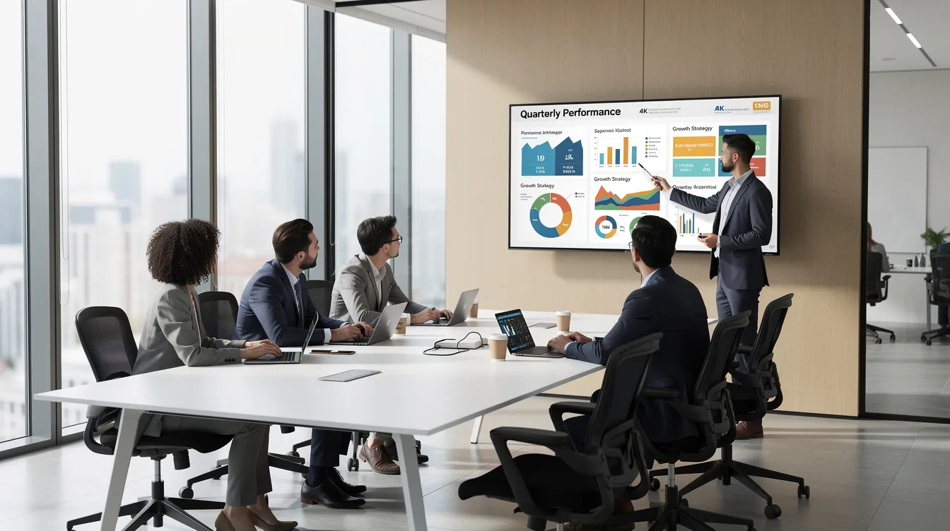
Presentation Design Elements
In today’s presentation world, the difference between a forgettable slide deck and a memorable one often comes down to presentation design. Effective presentations rely on a careful balance of text, images, charts, and other visual aids to communicate ideas clearly and persuasively. Modern presentation software—such as PowerPoint, Google Slides, and Apple Keynote—offers a robust toolkit for crafting slides that not only inform but also engage.
Organizing Content for Impact
Slide design techniques play a pivotal role in organizing content and guiding the audience’s attention. Strategic use of bullet points, concise headings, and well-structured subheadings helps break down complex information into digestible pieces. Color graphics and thoughtfully chosen images can reinforce key messages, while visual effects like subtle transitions or highlights draw focus to what matters most.
Visual Storytelling and Brand Consistency
A good presentation leverages these elements to create a cohesive narrative. For example, integrating charts and graphs transforms raw data into compelling visual stories, making trends and insights instantly recognizable. Meanwhile, consistent use of color schemes and fonts ensures brand alignment and professionalism across every slide.
Tools and Best Practices
Whether you’re building a pitch deck in PowerPoint, collaborating in Google Slides, or designing in Apple Keynote, the fundamentals remain the same: clarity, visual hierarchy, and purposeful design. By mastering these presentation design elements, anyone can elevate their slide decks from basic to impactful—turning every presentation into an opportunity to connect and persuade.
Transition: As organizations demanded more data-driven insights, presentations evolved from static storytelling to living, recurring reports powered by real-time data.
The Age of Data: Presentations as Living Reports, Not Static Slides
Rise of Data-Driven Presentations
From roughly 2010 onwards, presentations in finance, private equity, marketing, research, and HR shifted toward being data-heavy, recurring reports rather than one-off storytelling decks.
Common Recurring Slide Types
-
Monthly P&L summaries pulling from Excel
-
Pipeline funnels from CRM systems like Salesforce
-
Performance dashboards connected to SQL databases or Google Sheets
-
Marketing KPI reports drawing from multiple platforms
-
Quarterly fund reports for portfolio companies
Most organizations still manage these data slides manually. Analysts copy numbers from spreadsheets, rebuild charts, re-check filters, and recreate tables each reporting cycle, a pattern that mirrors broader financial reporting automation challenges in manual data-to-presentation workflows. The presentation becomes less about storytelling and more about data transcription.
The Scale of Manual Effort
Consider the scale: a finance or PE team preparing a monthly management report of 80-120 slides might dedicate 1-3 days of concentrated work per cycle for a single analyst. For a firm generating quarterly fund reports across 30+ portfolio companies, or weekly marketing performance decks for 10 markets, the hours compound rapidly.
Pain Points in Manual Reporting
-
Version chaos: Multiple people editing creates conflicting files
-
Last-minute changes: Updated numbers cascade through dozens of slides
-
Transcription errors: Studies suggest 1-5% error rates in manual data entry
-
Inconsistent branding: Different team members apply formatting differently
-
Export burden: Stakeholders expect PPTX, PDF packs, and sometimes MP4 video summaries
Transition: As the demand for timely, accurate, and visually compelling reports grew, video presentation techniques and automation tools began to reshape the landscape.
Video Presentation Techniques
As presentation technology has advanced, video presentations have emerged as a powerful way to reach and engage audiences—whether in a boardroom, a virtual sales pitch, or a global training session. Creating slides for video requires a blend of traditional design skills and an understanding of dynamic storytelling, leveraging both classic tools like flip charts and modern features found in today’s presentation software.
Microsoft PowerPoint, since its first ever version in 1987, has revolutionized the way presenters deliver content. Today, features such as slide transitions, animated transitions, and seamless video embedding allow users to craft presentations that flow smoothly and capture attention. These capabilities, combined with digital projectors and online sharing platforms, make it possible to deliver a video presentation to audiences anywhere in the world.
Incorporating elements like cardboard posters or flip charts—even in a digital format—can add a tactile, personal touch to your video presentations, making them more relatable and interactive. The key is to use animated transitions and slide transitions thoughtfully, guiding viewers through your narrative without overwhelming them with unnecessary effects.
A well-executed video presentation can transform a standard sales pitch into a memorable experience, blending the best of traditional visual aids with the latest in presentation technology. As PowerPoint and other tools continue to evolve, presenters have more options than ever to create slides that not only inform but also inspire—proving that the art of presentation is as much about innovation as it is about communication.
Transition: Despite these advances, many teams still struggle with the time and risk involved in manual reporting—a challenge that automation is poised to solve.
The Cost of Manual Presentation Reporting: Time, Risk, and Lost Opportunities
Time Consumption Estimates
-
A team preparing recurring decks (board packs, investor reports, KPI dashboards) may spend 20-40% of their monthly capacity on copy-paste and formatting.
-
A private equity firm generating 50 monthly portfolio reports manually, each taking 3-4 hours, results in 150-200 hours of repetitive work per cycle.
-
Knowledge workers spend an estimated 5-10 hours weekly on PowerPoint-related tasks.
Typical Manual Workflow Tasks
-
Refreshing Excel files and updating pivot tables
-
Copying values and charts into PowerPoint
-
Adjusting labels, formatting, and conditional coloring
-
Double-checking every figure against source data
-
Exporting PDFs and managing folder structures
-
Recreating the next slide deck from scratch next month
Quality and Governance Risks
| Risk Type | Impact |
|---|---|
| Human error | Incorrect numbers reach stakeholders |
| Outdated data | Decks presented with stale figures |
| Broken formulas | Charts display wrong values |
| Audit difficulties | No clear trail of how numbers were produced |
| Brand inconsistency | Logos, colors, fonts vary across versions |
| Compliance exposure | Old slides circulate with outdated data |
The opportunity cost is significant. Analysts and managers spend evenings before deadlines fixing slides instead of interpreting what the data means. Senior professionals review formatting rather than providing strategic recommendations. This is why many teams look to reporting automation resources and customer success stories to rethink how they produce recurring decks. The first presentations of each cycle carry risk; the last ones carry exhaustion.
Our customers have taught us their own lessons: manual processes don’t scale. Every additional report variant, market, or client multiplies the burden, often prompting stakeholders to reach out via INSYNCR’s contact and company information page to explore implementation.
Transition: Automation offers a solution, transforming static decks into live, data-driven presentations that save time and reduce risk.
Automation Enters the Stage: From Static Decks to Live Data-Driven Presentations
What Is Presentation Automation?
Presentation automation emerged around the mid-2010s with a simple shift in thinking: instead of treating slides as final outputs, they become “views” on underlying data sources that refresh on demand.
Key Capabilities of Modern Automation Tools
-
Direct data connections: Linking slides to Excel, CSV, Google Sheets, SQL databases, APIs (JSON/XML), and systems like Salesforce
-
In-slide filtering: Applying filters directly within presentations (by region, client, fund, or product)
-
Bulk generation: Creating multiple variants from a single template in one run
-
Conditional logic: Showing or hiding slides based on thresholds or values
This represents a natural next step in presentation technology. Computers are now powerful and connected enough that manually retyping or re-pasting numbers is no longer necessary. The slide design techniques remain; the data flows automatically.
Automation vs. BI Dashboards
Traditional BI dashboards like Tableau offer some automation, but they serve different needs. Stakeholders in board rooms and investor meetings still expect downloadable PPTX files, PDF exports for email, and polished decks they can annotate. Automation for the presentation world must work within these familiar formats, as reflected in INSYNCR’s PowerPoint automation FAQ and licensing model.
Transition: INSYNCR is at the forefront of this evolution, providing specialized tools for automating recurring, data-heavy presentations.
INSYNCR’s Place in the Evolution: PowerPoint Automation for Live Reporting
INSYNCR is a PowerPoint plugin designed specifically to turn recurring, data-heavy presentations into live, automated reporting assets for teams, supported by detailed software guides on connecting and synchronizing data in PowerPoint.

How INSYNCR Works
INSYNCR connects Microsoft PowerPoint slides directly to live data sources—eliminating manual copy-paste entirely:
-
Excel and CSV files
-
SQL databases
-
Salesforce CRM
-
Google Sheets
-
JSON and XML feeds
Users create branded templates once, then reuse them indefinitely. The process follows a straightforward pattern:
-
Define data links for charts, tables, and text placeholders
-
Configure in-slide filters (e.g., “Country,” “Client,” “Fund,” “Brand”)
-
Save as a master reporting template accessible to the whole team
Batch Generation Capabilities
INSYNCR generates dozens or hundreds of deck variants in a single run. A private equity firm can produce 50 portfolio company reports in minutes rather than days. A marketing team can create 10-market performance variants from one template. Outputs include PPTX, PDF, and MP4 formats.
Conditional Formatting and Logic
-
Show or hide slides based on thresholds
-
Automatically color KPIs (red/amber/green RAG status)
-
Adapt commentary blocks when values cross certain limits
Team-Based Licensing
| Role | Capabilities |
|---|---|
| Automator | Design templates, configure data connections, set conditional logic |
| Viewer | Open, refresh, and use templates safely without editing underlying logic |
Connecting to earlier pain points: INSYNCR minimizes last-minute rushes by enabling same-day refreshes. Numbers are always current at refresh time. Branding stays consistent because everyone uses the same master template. Human error drops because data flows automatically rather than through manual transcription.
Use cases mirror the recurring reports we’ve discussed: finance monthly P&L reporting (automating 90% of updates), private equity portfolio monitoring (50 reports generated in minutes), and marketing performance decks (10-market variants from one template), echoing many of the automation success stories across industries.
Transition: For teams ready to move from manual to automated reporting, a step-by-step approach ensures a smooth transition and lasting results.
Practical Tips: Moving from Manual Decks to Automated, Live Presentations
Teams don’t need to automate everything at once. Start with your highest-impact recurring presentations and expand from there, drawing on articles and resources about automating financial and KPI reporting to prioritize where to begin.
Step-by-Step Process
-
Inventory recurring decks: List your regular reports—quarterly board pack, monthly sales review, weekly performance report—and estimate hours consumed per cycle. Many teams discover they’re spending 50+ hours monthly on just a handful of recurring decks.
-
Identify data-driven slides: Separate slides that contain data (tables, charts, KPIs) from static content (company overview, methodology, disclaimers). Data-driven slides typically represent 70% of manual effort despite being a smaller portion of total slide count.
-
Standardize branded templates: Create a small set of approved PowerPoint templates with agreed layouts for charts, tables, comments, and cover slides. This pre-design work pays dividends in consistency.
-
Connect with INSYNCR: Link critical elements to their underlying data sources and configure filters and conditional formatting rules. Initial setup typically takes 4-8 hours per template but saves hundreds of hours over subsequent cycles, and INSYNCR’s help center and technical resources support teams through this phase.
-
Pilot on limited scope: Test the automated template on one business unit or fund for a few cycles. Measure time saved, reduction in errors, and improved turnaround before scaling.
-
Scale and expand: Roll automation across more markets, teams, or portfolios. Introduce bulk export where many recipients need tailored versions—each client gets their own report, each region sees their own data, and select an INSYNCR subscription plan that matches your automation scale.
The key insight: Use the time freed from manual work for deeper analysis, narrative improvement, and stakeholder engagement. Creating slides should take minutes, not days.
Transition: As automation becomes the new standard, the future of presentations promises even greater integration of AI, personalization, and real-time data.
Looking Ahead: The Future of Presentations and Automated Reporting
The evolution of presentations continues. AI-assisted slide design, automated narrative suggestions, and tighter integration between BI tools and PowerPoint are already emerging. According to industry forecasts, 80% of recurring decks may be automated by the end of 2026.
Trends Shaping the Future
-
Interactive, personalized presentations will grow—content that reconfigures itself for a specific stakeholder’s role, region, or portfolio, driven by real-time data.
-
Some organizations experiment with immersive environments, though for 2026, the practical reality remains: PowerPoint, PDFs, and MP4 summaries drive decision-making.
-
Automation serves as the non-optional foundation for this future. Without automated data updates and standardized templates, scaling personalization and real-time reporting safely becomes impossible.
Google Books and white paper research will continue exploring presentation technology trends, but the core workflow remains familiar.
INSYNCR positions itself within this trajectory—enabling teams to move from static decks to dynamic, always-current reporting while staying inside familiar PowerPoint workflows. Whether you’re presenting to a board room via a TV show-style production or distributing investor updates like the Coca Cola Company might to global stakeholders, live data automation represents the next chapter.
Ready to experience how automated presentations fit into your own evolution story? Start your free 7-day INSYNCR trial and transform your recurring reports from manual burdens into living, always-current assets.


