 Skip to content
Introduction: Why Interactive Data Presentations Matter in 2026
If you’ve ever spent the night before a board meeting rebuilding PowerPoint charts because the numbers changed, you understand the problem. Static data presentations—those fixed slides exported from Excel—can’t answer the follow-up questions stakeholders inevitably ask. “Can you show me just EMEA for the last six months?” becomes a promise to send a follow-up email rather than a real-time answer.
Interactive data presentations change this dynamic entirely. Instead of forcing one predetermined view of complex data, they let viewers explore charts, apply filters, toggle between scenarios, and drill into granular details directly within the presentation itself. Interactive content includes elements like clickable hotspots, animations, hyperlinks, and multimedia features that actively engage the audience.
For teams managing monthly board packs, weekly performance reviews, quarterly investor updates, or recurring client reports, this shift from static to interactive transforms how insights are communicated. Interactive data presentations are widely used in business intelligence (BI), sales presentations, and data journalism. Using interactive elements in presentations can significantly boost audience engagement and retention of information. With modern tools, you can create interactive data visualizations without extensive design or coding knowledge, making it easier than ever to deliver dynamic, engaging presentations, and broader resources on reporting automation and performance-focused content can help teams evolve their overall reporting strategy.
This article will walk you through what interactive data presentations actually are, core principles for designing them, specific interaction types that work in PowerPoint, and the manual effort required to maintain them without automation. You’ll also learn how INSYNCR’s PowerPoint automation can help you create presentations that stay accurate, branded, and interactive—without the midnight Excel sessions.
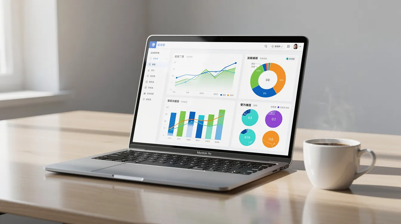
What Are Interactive Data Presentations?
Interactive data presentations are dynamic, user-driven visual displays such as dashboards or charts that allow viewers to actively explore, filter, and manipulate data in real-time.
Interactive data presentations are presentations where viewers can actively engage with charts, filters, time ranges, and scenarios directly in or from PowerPoint rather than passively consuming fixed visualizations. Unlike static charts that show one locked view of raw data, interactive presentations invite exploration.
Concrete interaction types include:
-
Slicers and filters: Select by region, product, business unit, or time period
-
Drill-down navigation: Click a 2025 revenue bar to reveal monthly breakdown
-
Click-to-reveal tooltips: Tap an icon to surface deeper insights or commentary
-
Scenario toggles: Switch between Budget vs Actual vs Forecast with a button
For example, a 2025–2026 revenue dashboard slide might show a single trend line at the top level, with interactive controls allowing users to explore by product, region, or customer segment. A private equity portfolio slide could include a company selector that instantly updates IRR, MOIC, and revenue trends for each holding.
This differs from full BI dashboards like Tableau or Power BI, which are designed for deep exploration by analysts. Interactive presentations are curated narratives tailored to specific audiences, with interactivity supporting predetermined decision points. You can also embed interactive visualizations or other media—such as videos or maps—directly into slides or websites, making it easy to share and integrate content across platforms. And because many enterprises still distribute PPTX, PDF, or MP4 exports, the interactivity must coexist with PowerPoint as the core format.
Interactive presentations can be shared online, allowing audiences to explore content at their own pace.
Why Static Data Slides Fall Short
The typical 2024–2026 workflow looks something like this: export data from your ERP or BI tool into Excel, restructure pivot tables, create charts, copy them into PowerPoint, and do it all over again when numbers change—often the night before a critical meeting.
Problems compound quickly:
-
Stakeholders ask for different breakdowns (“show me only APAC, Q4 only”) that the static deck can’t provide
-
Multiple versions circulate via email, creating confusion about which numbers are correct
-
Charts in the presentation don’t match the BI dashboard because of timing differences
-
Any structural change (adding a new KPI or region) requires updating dozens of slides manually
Consider a finance team preparing a 30-slide monthly performance deck covering 4 regions and 6 business units. Each month, analysts spend 6–10 hours exporting data, rebuilding charts, fixing formatting, and verifying hyperlinks. When a board member asks, “What’s driving the margin decline in EMEA?” during the meeting, the presenter must either switch to Excel mid-meeting or promise to follow up later.
Static exports become outdated the moment new transactions, bookings, or campaign results arrive. This undermines trust in the data story you’re trying to tell.
Core Principles of Effective Interactive Data Presentations
Interaction adds value only when the underlying story, visuals, and clear narrative structure are sound. Before adding filters and drill-downs, ensure these five principles guide your design:
-
Audience clarity: Match interaction complexity to viewer roles
-
Narrative flow: Present a coherent top-level story with deeper exploration available on demand
-
Visual simplicity: Keep slides clean; let interaction reveal detail
-
Purposeful interactivity: Every control should answer a specific question
-
Trust in data freshness: Stakeholders must believe the numbers are current
These principles matter most for recurring reports—monthly KPI decks, investor updates, and client reports—where the structure stays constant but data and questions evolve.
Audience Clarity
A March 2026 board meeting needs different interactivity than an internal sales stand-up or a client performance review. Executives typically want high-level key performance indicators with minimal clicks. Managers need the ability to filter and drill into their specific remit. Analysts often benefit from richly interactive, detailed views.
Before designing, map your audience types and decide which questions they’ll want to answer themselves during the presentation. A CFO presentation might offer board members simple toggles between “Group,” “Region,” and “Business Unit” views rather than overwhelming them with dozens of controls.
Keep controls obvious and limited. A few meaningful filters beat a dashboard crammed with confusing widgets that distract from your key points.
Narrative Flow
Progressive disclosure is the core technique: present your top-level data story on the slide, with deeper layers revealed through filters or drill-downs when needed. This supports decision making without overwhelming viewers upfront.
Example approach:
-
Main slide: 2022–2025 revenue growth line chart showing the big picture
-
Interactive controls: “By Product,” “By Region,” or “New vs Existing customers”
-
Presenter narrates the headline trend; audience explores details during Q&A
Avoid pre-baking every breakdown onto separate slides. Instead, rely on interactive states that activate when questions arise. This keeps slide count manageable while still allowing users to find deeper insights.
Visual Simplicity
Not every chart type becomes better when interactive. Focus interactivity on visualizations where exploration genuinely reveals new understanding:
-
Time-series charts: Filter by date range to compare trends
-
Geographic maps: Interactive maps drilling from country to city level
-
Funnels: Click stages to see conversion rates by segment
-
Cohort charts: Select cohorts to compare retention patterns
-
Segment breakdowns: Toggle between customer types or product categories
Limit each interactive slide to a small set of related key metrics (revenue, margin, volume) rather than cramming 15 KPIs onto one view. Use color and visual design consistently with your brand template. INSYNCR can lock in branded styles across all automated decks, ensuring impactful visuals that stay on-brand.
Purposeful Interactivity
Every interactive control should serve a clear purpose and answer a specific business question. Avoid adding interactivity for its own sake; instead, ensure each filter, toggle, or drill-down is mapped to a real decision point or recurring stakeholder inquiry.
Trust in Data Freshness
Stakeholders must believe the numbers are current and accurate. Interactive presentations should always reflect the latest available data, and any updates or changes should be seamlessly integrated to maintain trust and credibility.
Types of Interactivity That Work Well in PowerPoint-Based Reporting
This section provides a practical catalog of interaction patterns that translate well into presentation formats and support better decision making during live meetings. Interactive content includes elements like clickable dashboards, live polling, and non-linear navigation, which actively engage the audience and make presentations more dynamic.
Interactive visualizations deliver better results than static counterparts in terms of engagement and understanding. Live polling, non-linear navigation, and embedded clickable dashboards are effective methods for creating engaging interactive presentations.
Some effects live directly inside PowerPoint (hyperlinks, triggers, in-slide filters), while others come via embedded content or automated exports. The goal is always the same: help stakeholders understand complex information without breaking the presentation flow.
Filtering and Parameter Selection
Simple, business-focused filters are the most broadly applicable interactive elements:
| Filter Type | Example Use Case |
|---|---|
| Region | Americas, EMEA, APAC toggle |
| Time Period | Last 7 days, Last 30 days, Quarter to date |
| Business Unit | Sales, Marketing, Operations |
| Product Category | Software, Services, Hardware |
| Customer Segment | Enterprise, Mid-market, SMB |
| A marketing performance slide for 2026 campaigns might include a time period selector allowing users to instantly compare recent performance against longer trends. Instead of creating four separate regional slides, one slide with a region filter serves all needs. | |
| With INSYNCR, these filters connect directly to underlying data queries in Excel, SQL, Salesforce, or Google Sheet sources—so values and interactive charts update automatically when data refreshes. |
Drill-Down Navigation and Linked Views
Drill-down allows deeper exploration through clickable elements. Clicking a bar for 2025 reveals monthly breakdown; clicking “EMEA” shows country-level detail on a linked slide.
Private equity example: A portfolio overview slide displays high-level metrics for all 25 companies. Clicking a company name navigates to its detailed performance slide showing IRR, MOIC, and revenue trends. The overview stays executive-friendly while granular details are one click away.
INSYNCR can generate consistent, linked detail slides in bulk—40+ portfolio company reports from one template. Keep drill paths shallow (2–3 levels maximum) to avoid user confusion, and make navigation controls obvious with buttons or text links.
Click-to-Reveal and Hover-like Detail
Click-to-reveal keeps main slides clean while still letting presenters answer “what’s behind that number?” in the moment. Clicking an icon or marker reveals a textbox with deeper explanation, commentary, or exact values.
HR example: A diversity slide shows high-level percentages by department. Clicking a department name reveals detailed breakdown by gender, age group, and tenure for 2024–2025.
While native “hover” is limited in PowerPoint, similar effects can be achieved via triggers that show/hide shapes. INSYNCR can populate these detail callouts from live sources—commentary columns in Excel or database fields—creating high quality data visualizations that update automatically.
Scenario, Version, and Period Toggles
Scenario toggles let viewers compare multiple states within a single slide:
-
Budget vs Actual vs Forecast
-
Base vs Optimistic vs Downside
-
Before vs After initiative launch
Financial planning example: A 2023–2026 planning slide includes buttons that switch the entire view between budget, actual, and latest forecast while keeping the layout identical. This eliminates slide duplication and ensures stakeholders always compare like-for-like views.
INSYNCR can bind each toggle state to a different data range or query—separate forecast tables in SQL or Excel—while preserving formatting. Limit toggles to 3–4 views to keep interaction manageable for non technical audiences.
Using Animation to Show Change Over Time
Animations should support understanding rather than just add flair. An animated bar chart race showing monthly revenue by region from Jan 2024 to Feb 2026 helps audiences track which regions are accelerating or decelerating.
INSYNCR supports exporting automated, data-driven slideshows as MP4, ensuring animations always reflect the latest data. This is useful for asynchronous distribution—sending a 60-second KPI summary to stakeholders who can’t attend live meetings.
Avoid overly complex transitions that distract during video calls where bandwidth issues may cause stuttering. Simple, purposeful animations deliver stunning results without the technical headaches.

How Much Manual Work Does This Take Without Automation?
Creating and maintaining interactive-style presentations using only Excel and PowerPoint requires significant recurring effort, mirroring the broader inefficiencies of manual data-to-presentation workflows in finance and reporting. Let’s quantify a realistic scenario.
Monthly KPI pack specifications:
-
25 slides covering 5 regions and 10 product lines
-
Data exported from ERP, BI platform, and data warehouse
-
Updated by 1–2 analysts with senior review
Time breakdown per monthly cycle:
-
Data extraction and consolidation: 1.5–2 hours
-
Chart and table recreation: 3–4 hours
-
Formatting and QA: 1–2 hours
-
Hyperlinks and navigation checks: 0.5–1 hour
-
Version control and distribution: 0.5–1 hour
Total: 6–10 hours
-
Add 1–2 hours of supervisory review, and you’re looking at 8–12 labor hours per monthly cycle.
-
Annually, that’s 96–144 hours dedicated to one recurring report.
-
At $75/hour fully-loaded cost, the annual expense is $7,200–$10,800 for a single deck.
Any structural update—adding a new KPI, region, or scenario—multiplies work across all affected slides. Broken copy-paste links, forgotten filters, and late-night last-mile editing before board deadlines compound the pain.
Disadvantages and Risks of Manual, Static, or Semi-Interactive Work
Manual workflows create strategic risks beyond just wasted time. Poor decisions stem from stale data. Stakeholder trust erodes when numbers don’t match. Highly paid analysts spend hours on formatting rather than analysis.
Key disadvantages:
-
Error-proneness: Manual copy-paste introduces transcription mistakes (typing 1.2M instead of 12M)
-
Lack of scalability: Adding one new channel to a marketing deck can consume 4–6 hours across 20+ charts
-
Inconsistency: Different analysts may calculate the same metric differently
-
Slow response: Ad-hoc questions during meetings require switching to Excel or promising follow-ups
-
Governance failures: Multiple versions circulate with no single source of truth
Concrete example: A Q4 2025 investor deck where EBITDA margin differs between slide 5 and slide 9 because only one chart was updated after a late data revision. Such discrepancies—even when corrected later—permanently damage confidence in your data storytelling.
A connected, automated approach removes much of this friction while keeping PowerPoint as the core medium your team already knows.
Using a Blank Canvas to Create Interactive Visualizations
Starting with a blank canvas to create interactive visualizations can feel overwhelming, but it’s also where some of the most impactful data stories begin. Unlike working from a ready-made template, a blank canvas gives you the flexibility to design visuals that are perfectly aligned with your project’s goals and your audience’s needs. This approach is especially valuable when you need to communicate complex data in a way that’s both engaging and easy to understand.
Modern data visualization tools like Infogram and Genially empower users to transform raw numbers into interactive charts, maps, and graphs—no coding required. These platforms offer a wide array of interactive elements, allowing you to highlight key metrics, reveal trends, and enable deeper exploration of your data. For example, you might build an interactive map to visualize regional sales performance, or design a set of interactive charts that let users filter by product line or time period to uncover hidden insights.
The real advantage of starting from a blank canvas is the ability to customize every aspect of your interactive visualizations. You can choose the chart type that best fits your data, arrange visuals to support a clear narrative structure, and add interactive elements that invite your audience to explore granular details. This is particularly helpful for non-technical audiences, as interactive visuals make it easier to communicate complex information without overwhelming viewers.
By leveraging these tools and techniques, you can create high-quality, interactive data visualizations that not only present key points but also encourage your audience to engage with the data story. Whether you’re building a dashboard for a board meeting or an interactive report for clients, starting with a blank canvas ensures your visuals are tailored, accessible, and ready to inspire action.
Designing Interactive Data Presentations Step by Step
This practical workflow helps teams that need to operate inside PowerPoint but want interactivity and reliable data. The process works especially well for recurring reports where setup effort pays off over time.
Step 1: Define Decisions and Questions First
Start by listing the concrete questions your audience asks repeatedly:
-
“Which region underperformed vs budget in 2025?”
-
“Which campaigns delivered highest ROAS last quarter?”
-
“What’s driving the headcount variance?”
Every interactive element should answer at least one of these questions. A finance team might define 8–10 core questions driving their 2026 monthly performance deck, then map each to 1–2 interactive visualizations. Prioritize recurring questions that appear every month—these justify investing in automation.
Step 2: Select Metrics, Layout, and Story Arc
Build from a simple story arc: “Where are we now? What changed? Why? What next?”
Example slide flow:
-
Overview KPIs (the big picture)
-
Revenue and margin trends
-
Regional breakdown
-
Product breakdown
-
Drivers and initiatives
-
Outlook and context
Choose 5–10 core metrics (revenue, margin, churn, CAC, NPS) that appear consistently across time, segments, and scenarios. Lock in title positions, chart placeholders, commentary boxes, and brand colors in your PowerPoint template. INSYNCR can transform this standard layout into a reusable automation template.
Step 3: Plan Interactivity on Paper First
Sketch which controls belong on which slides before building anything:
Revenue slide controls:
-
Year selector (2024, 2025, 2026)
-
Region selector (Global, Americas, EMEA, APAC)
-
Budget/Actual toggle
Avoid overengineering. For senior audiences, focus on a few high-value interactions; leave complex deeper exploration to BI tools. Keep control labels in plain business language (“Region” not “geo_code”).
Step 4: Connect to Live or Refreshable Data Sources
Typical data sources include Excel workbooks, Google Sheets, SQL databases, Salesforce reports, and JSON/XML APIs. Without automation, teams manually export from these systems into Excel, then into PowerPoint, every cycle.
INSYNCR instead connects PowerPoint directly to these sources, mapping each chart and table to specific fields and queries. A “Monthly Revenue by Region” slide connects to a SQL view or Excel table. Once mapping is complete, refreshing the deck for the next month becomes a one-click operation—no coding required—instead of a full rebuild.
Step 5: Test, Iterate, and Standardize
Run a real meeting using the new interactive deck and track which interactions are actually used. Simplify or remove features that confuse users; enhance those that drive better questions.
Document the template and interaction patterns so others in the team can adapt them. With INSYNCR, once a template is stable, teams can roll it out across regions, business units, or clients with consistent logic and branding. Set a quarterly review to align with new KPIs or strategic priorities.
Automation with INSYNCR: Turning Interactive Concepts into Scalable Workflows
INSYNCR is a B2B PowerPoint add-in that connects slides to live data sources, automates recurring reports, and preserves brand consistency across dozens or hundreds of presentations. It works with existing tools—PowerPoint, Excel, SQL, Salesforce, Google Sheets, and JSON/XML sources, and its FAQ on licenses, data sources, and requirements explains how Automator and Viewer roles collaborate securely.
The biggest gains appear when teams move from manual monthly decks to template-driven, automated generation. With team-based licensing (Automators design templates; Viewers refresh and present), even non-technical presenters can keep reports current.
Live Data Integration and Refresh in PowerPoint
INSYNCR lets you bind PowerPoint placeholders to named data sources: Excel ranges, SQL queries, Salesforce reports, Google Sheets tabs, or JSON/XML endpoints. A finance template where charts on slides 3–10 pull from a central Excel model becomes refreshable with one button press.
Refreshing the March 2026 deck means pressing refresh rather than re-exporting and re-pasting every chart. Live connections reduce version confusion and eliminate mixing February and March numbers on different slides. Interactive elements—toggles, filters, multi-state visuals—always reference the same fresh live data.
Template-Based Report Generation and Branding Consistency
INSYNCR templates are branded PowerPoint files where data-driven elements (charts, tables, text) are tagged and tied to data sources. A consulting firm’s client performance template ensures every client receives the same 25-slide structure populated with client-specific data, following step-by-step software guides for connecting data and automating slides.
Every interactive element behaves identically across clients or regions. Brand colors, fonts, and layouts are locked in, removing manual formatting needs. You can easily share consistent, professional reports without worrying about design drift.
Conditional Formatting and In-Slide Highlighting
Automatically color KPI cards red/amber/green based on thresholds. Highlight outlier rows. Flag underperforming segments.
HR example: A monthly report highlights departments where turnover exceeds 15% YTD in red directly in the slide table. Presenters immediately focus attention on problem areas when filters are applied. Thresholds stored in your data source apply consistently every month—no manual recoloring required.
Batch and Personalized Report Generation
One of INSYNCR’s major advantages is bulk generation of interactive-style presentations for multiple stakeholders in one run.
Private equity example: Generate 40 portfolio company performance decks for Q1 2026, each with company-specific charts, benchmarks, and commentary—from a single template. This is particularly powerful for client reporting in agencies, research organizations, and multi-brand corporations.
Automator licenses design and wire templates; Viewer licenses refresh and present without touching underlying logic.
Output Flexibility: PPTX, PDF, and MP4
INSYNCR supports multiple export formats, and its subscription plans for Starter, Business, and Professional tiers let teams choose the right level of automation and collaboration features:
| Format | Best Use Case |
|---|---|
| PPTX | Live interactive presentations |
| | Static distribution, archival, compliance |
| MP4 | Asynchronous video summaries for remote teams |
| Because formatting is template-driven, exports remain consistent across all generated reports. Unlike competitors requiring you to leave PowerPoint, INSYNCR keeps teams in the environment they already use daily, making it accessible to everyone. |
Practical Examples of Automated Interactive Data Presentations
Data visualization examples can inspire teams to create engaging storytelling and explore complex data, demonstrating effective techniques for interactive data presentations. Tools like Hex, Tableau, and Google Data Studio also help present analysis results effectively.
These 2024–2026 scenarios illustrate where INSYNCR-style automation delivers the most value, similar to the customer outcomes showcased in INSYNCR success stories across industries.
Finance: Monthly Performance Pack Automation
A multinational’s group finance team produces a 35-slide board pack monthly covering 2019–2026 trends. Previously, this required exporting from ERP/BI to Excel, reworking pivot tables, and screenshotting charts into PowerPoint—about 10 analyst hours.
With INSYNCR: connect slides to a centralized SQL view, define thresholds and filters, and generate the updated deck after each close in under 30 minutes. Board members can filter by region or business unit in-slide and compare current vs prior year without additional slides. Time savings: ~8 hours monthly, or roughly $7,200 annually.
Private Equity: Portfolio Company Dashboards
A PE firm with 25 portfolio companies produces quarterly reports covering revenue, EBITDA, debt, and operational KPIs. The old method meant separate Excel models and PowerPoint decks per company—inconsistent formats and frequent errors.
INSYNCR approach: single standard template with company selector, period selector, and scenario toggles. Auto-generate all 25 reports. Conditional formatting highlights debt/EBITDA above threshold in red. Faster, more transparent LP communication with reliable, comparable visuals across the world of portfolio companies.
Marketing and Growth: Campaign and Channel Performance
A digital marketing team reports weekly results from Google Ads, Meta, LinkedIn, and email platforms. Typical workflow: CSV exports, manual aggregation, static slides outdated within days.
INSYNCR can connect to a Google Sheet where campaign metrics sync daily. Interactive filters (channel, campaign, region, audience) let stakeholders explore performance during meetings. Time saved enables more focus on optimizing campaigns based on live ROAS and CPA rather than rebuilding graphs.
HR and People Analytics: Recurring Workforce Dashboards
HR leadership presents quarterly, tracking headcount, hiring, turnover, diversity, and engagement from 2022–2026. Multiple HR systems and spreadsheets create inconsistent layouts and delayed insights.
INSYNCR pulls consolidated views from Excel or HRIS exports and populates a standard interactive deck. Filters by country, department, seniority; toggles for headcount vs FTE. Conditional formatting highlights departments with high turnover or low engagement, inspiring action where it’s needed most.
Best Practices for Maintaining Trustworthy, Interactive Reports at Scale
Once interactive, automated decks become part of core decision workflows, they must be reliable.
Establish Clear Ownership
-
Establish clear ownership of templates and data sources
Document Metric Definitions
-
Document metric definitions and calculation logic
Control Access
-
Control access via Automator vs Viewer roles
Validate Data Before Refresh
-
Validate data before refresh (verify month-end close, totals match source systems)
Keep Interaction Patterns Consistent
-
Keep interaction patterns consistent across all recurring reports
INSYNCR’s architecture supports this by centralizing template logic while letting many Viewers safely refresh and use reports, and its help center with guides, release notes, and support options underpins reliable, long-term operations.
Getting Started with INSYNCR for Interactive Data Presentations
The value is clear: less manual work, consistently branded presentations, and live connections to trusted data sources. Here’s how to begin:
-
Identify one recurring report (e.g., monthly management report for April 2026)
-
Design a template with your key interactive elements
-
Connect data sources (Excel, SQL, Salesforce, Google Sheets)
-
Pilot with a small group and iterate based on feedback
Quantify your current effort—hours per cycle, people involved—and estimate savings from automation. Many teams recover 80%+ of their manual reporting time, as reflected in INSYNCR resources on reporting automation, updates, and customer stories.
Ready to transform your static slides into live, interactive data presentations? Start a free 7-day trial of INSYNCR and, if you have specific questions or procurement needs, reach out via INSYNCR’s contact and company information page to connect with the team and move your project forward.


