Skip to content
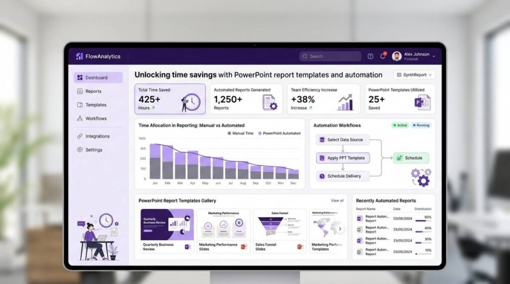
Recurring reports are supposed to accelerate decision-making. In reality, many teams burn days on the same low-value work: copying numbers from source systems, reformatting slides, fixing chart labels, and chasing “final_final_v7” versions.
The fastest path out of that cycle is surprisingly simple: standardize your narrative with pre-formatted PowerPoint report templates, then automate how data flows into those templates. Done well, teams routinely cut production time by up to 80% (and in some cases more), while improving consistency, accuracy, and stakeholder trust.
Why report production time balloons in PowerPoint
PowerPoint is where executives want the story. But it’s rarely where the data lives. That gap creates a workflow that scales badly:
- Data is spread across Excel, SQL databases, CRMs, and BI exports
- Each reporting cycle requires manual refresh, copy-paste, and visual cleanup
- Formatting becomes the bottleneck, not analysis
- Errors creep in during repetitive updates, often caught late
PowerPoint itself isn’t the problem. The lack of systematized templates and automated refresh is.
Templates: the “fixed cost” that pays back every cycle
A strong report template isn’t just a theme. It’s a reusable reporting system that encodes your organization’s standards.
What a high-performance template includes
A template built for recurring reporting typically has:
- A consistent slide architecture (KPIs first, then drivers, then breakdowns)
- Standard chart types per metric (so viewers learn the pattern)
- Locked design components (titles, footers, legends, brand styles)
- Reusable table and chart placeholders mapped to known data structures
- “Exception” callouts for outliers, deltas, and narrative commentary
This shifts work from “formatting every month” to “design once, reuse forever.”
The hidden win: template consistency reduces review time
Most teams underestimate how much time is lost in stakeholder review cycles. When each report “looks different,” leaders spend energy re-orienting. Consistent templates reduce clarification questions and speed approvals—especially for brand trackers, quarterly business reviews (QBRs), and sales dashboards.
Automation: the multiplier that removes manual refresh
Templates solve consistency. Automation solves scale.
Instead of rebuilding slides each cycle, automation connects your slides to live data sources and refreshes content on demand (or on schedule), so the deck stays current without manual rework. Tools like INSYNCR turn PowerPoint into a live reporting engine by integrating data directly into your presentation workflow and supporting bulk generation for repeatable outputs.
What becomes automatable (and what should stay human)
Automation is best used for repeatable, rules-based tasks:
- Refreshing KPI tiles, tables, and charts
- Updating period filters (month/quarter/date range)
- Applying conditional formatting (e.g., red/amber/green thresholds)
- Generating multiple client/region/product variants from one template
- Exporting in consistent formats (PPTX/PDF) for distribution
What should remain human-led:
- Interpreting drivers and anomalies
- Writing the “so what” narrative
- Deciding what to emphasize or de-emphasize for the audience
The goal is not to automate insight. It’s to automate everything that blocks insight.
Manual reporting vs template + automation: what changes operationally
| Area | Manual PowerPoint workflow | Template + automation workflow |
|---|---|---|
| Data updates | Copy/paste from multiple sources | Refresh from connected sources in-place |
| Time to produce | Hours to days per cycle | Minutes to hours, depending on narrative depth |
| Error risk | High (re-keying, stale exports) | Lower (direct source connections, repeatable logic) |
| Consistency | Depends on who built it | Standardized look and structure every cycle |
| Scale (multiple audiences) | Linear effort per variant | Bulk generation from one template |
Most time isn’t lost on “analysis.” It’s lost on everything surrounding it.
Common time sinks automation eliminates
- Reformatting charts after each data refresh
- Rebuilding tables to match slide spacing
- Updating dozens of KPI tiles across sections
- Creating multiple versions (per region, client, product line)
- Final checks for mismatched numbers between slides
When your template is standardized and your update process is automated, those activities shrink dramatically—freeing analysts to spend time on variance explanations, insight generation, and stakeholder recommendations.
A practical rollout plan for enterprise teams
Step 1: Choose one recurring report with high repetition
Start with something like:
- Monthly sales performance deck
- Brand tracking summary
- Weekly pipeline / forecast update
- Executive KPI dashboard
Pick a report with a stable structure and frequent refresh cycles.
Step 2: Stabilize the template before automating it
If the story structure changes every cycle, automation won’t stick. Lock down:
- Slide order and required sections
- Metric definitions (single source of truth)
- Visual standards (chart types, thresholds, formatting rules)
Step 3: Connect the data and define refresh rules
A modern PowerPoint automation approach should support:
- Multiple data sources (Excel, SQL, CRM, cloud storage)
- Selective refresh (update what matters, preserve design control)
- Conditional formatting rules for thresholds and alerts
INSYNCR, for example, is designed to work inside PowerPoint while connecting to a broad set of sources and supporting automation features like bulk slide generation and conditional formatting.
Step 4: Track outcomes like an operations project
Treat reporting as a process you can optimize. Measure:
- Median hours per report cycle (before/after)
- Error rate (corrections after first draft)
- Review cycles (number of stakeholder iterations)
- On-time delivery rate
- Analyst capacity reallocated to insights work
Best practices to keep automated templates “enterprise-grade”
Design for maintainability, not just aesthetics
Build slides so they can handle:
- Missing values
- New categories appearing in data
- Period-over-period comparisons
- Regional segmentation without layout breakage
Standardize metric definitions and naming
Automation amplifies whatever you feed it. If your organization has conflicting KPI definitions, you’ll scale confusion faster.
Separate the narrative layer from the data layer
A strong pattern is:
- Automated slides: KPI snapshots, tables, charts, recurring commentary blocks
- Analyst-authored slides: interpretation, recommendations, implications, next actions
This balance keeps the deck credible and decision-ready.
Why this matters now: faster reporting means faster decisions
When teams can produce reports quickly, they stop treating reporting as a monthly fire drill and start treating it as a management system. The organization gets:
- More frequent performance visibility
- Faster escalation of issues
- More time spent on drivers and corrective action
- Cleaner stakeholder communication with consistent visuals
If your analysts are still spending most of their reporting time formatting PowerPoint, you don’t have a reporting problem—you have an automation opportunity.